AI-POWERED DASHBOARD BUILDER
Beyond the dashboard: Designing AI that Guides, Fixes, and Builds
AI-powered dashboard builder that streamlines data exploration for users with varying technical skills. By embedding AI as a collaborative guide, not just a code generator. It transformed a manual, code-heavy process into a more intuitive, supportive experience.
role
Solo Product Designer
skills
Product design
User research & testing
Prompt testing
Roadmap planning
Interactive prototyping
TIMELINE
Design: April 2024 - July 2024
Launch: December 2024
OUTCOME
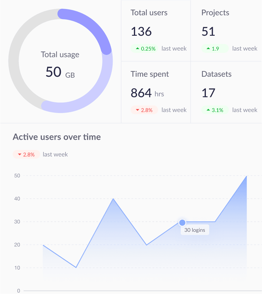
28%
Task success rate increased
48%
Task completion time reduced
90%
Active users adopted the AI feature
31%
Dashboard creation increased


COMPANY Background
Ludis Analytics is a SaaS platform for data preparation and deploying apps to generate insights. It supports national sports teams globally, including in the Olympics. While technical users could navigate Ludis comfortably, semi- and non-technical users often struggled with manual workflows and technical barriers.
Problems
Manual process of dashboard creation
Despite the rapid evolution of generative AI, many of our users still rely on traditional, code-heavy methods for data exploration and dashboard building.
We saw an opportunity to modernize these workflows—but the right path forward wasn’t obvious. There were many possibilities, and we needed to understand where AI could truly make a difference.
Business pressure
At the same time, investor expectations were rising.
We were being asked: “How is your platform leveraging AI?”
Our stakeholders were eager for innovation—not only to improve product value but to broaden our user base beyond just highly technical users.
user Segments
AI is exciting, but wait…
AI is full of exciting possibilities. But as a startup with limited resources, we can’t chase every direction. The challenge lies in identifying the right focus.
To move forward with clarity, our team took a step back to revisit our user base. We evaluated who would benefit most from AI-powered tools and identified three primary user segments, each with varying levels of technical expertise:
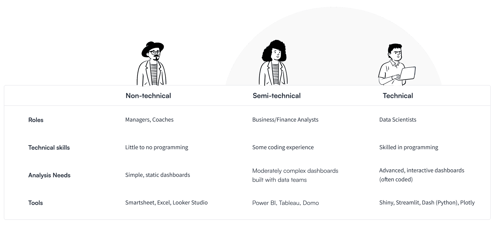
With the existing inline code editor feature on our platform, it is ideal for technical users already comfortable with coding and AI can enhance their workflows and boost productivity. However, we see a compelling opportunity to bridge the gap between semi-technical users and data scientists. With the right AI support, we believe these "in-between" users can gain greater independence and build more complex analyses.
USER INTERVIEW INSIGHTS
Inflexible tools, unclear visualization choices, and reliance on others
We conducted 5 in-depth interviews across the semi-technical and technical user segments to understand their day to day workflows.
Trial-and-error in visualization
Users often struggle to choose the right type of chart or graph, requiring multiple attempts to get it right.
I usually just try random charts until something looks close to what I need
Rigid, static dashboards
Existing tools limit flexibility, especially when users need to drill down or adjust views for deeper analysis.
Once the dashboard is published, it’s hard to adjust anything on the fly
Dependency on technical teams
Many rely on data engineers or scientists to build dashboards, leading to communication breakdowns, slower timelines, and extra meetings.
We met three times just to get the chart "right"
Dataset complexity
Users frequently work with multiple or inconsistent datasets, making integration difficult and slowing analysis
I copy data into Excel just so I can filter it how I want
User journey map
Building reports!
Beyond identifying pain points, we mapped out the end-to-end data analysis journey for our interviewee. We decided to focus on the “build report” phase where we saw the most potential to deliver value. Not only was it one of the most frustrating steps for both technical and semi-technical users, but it also aligned closely with our platform’s current core feature: an inline code editor built for dashboard deployment.

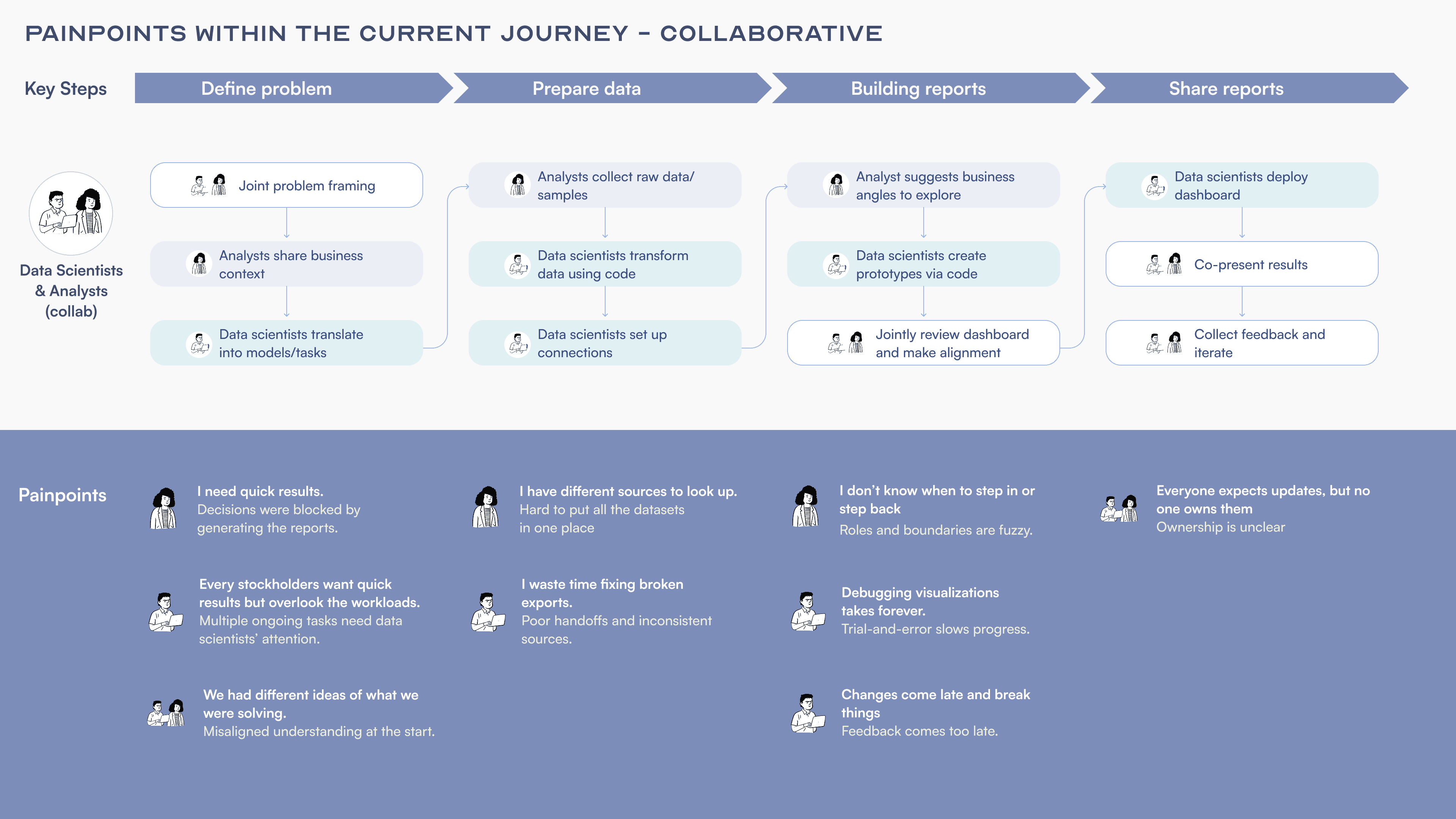
Explore & experiment
Walking in the User’s Shoes
To get the full story of the dashboard building experience and spot opportunities for AI, I challenged myself to build a dashboard using only my limited coding skills and GenAI support.
At the same time, we want to find a way to differentiate ourselves from existing AI tools where users simply copy and paste generated code into our platform without deeper integration or feedback loops. This hands-on experience surfaced several friction points—and opened up opportunities for more meaningful AI support:
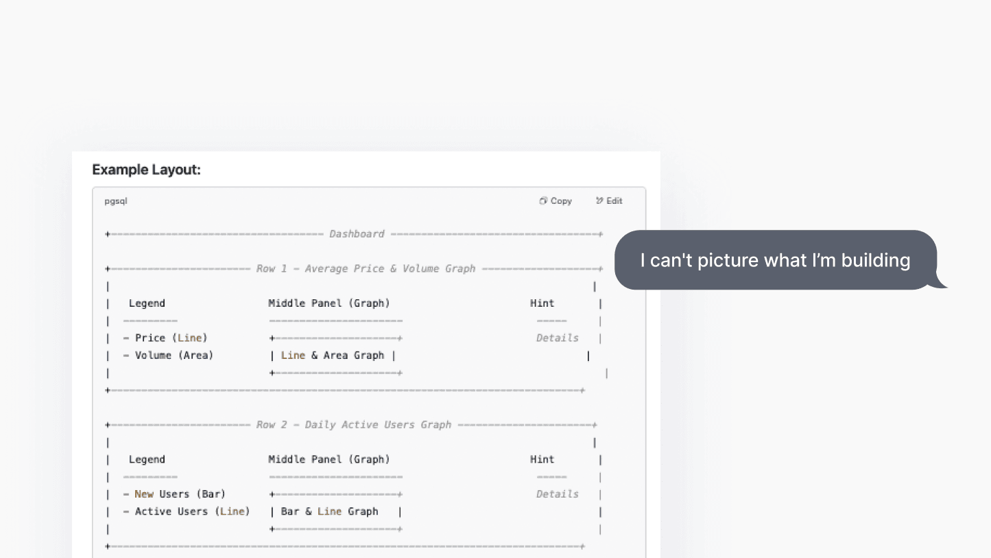
Lack of a clear starting point
Without contextual guidance or a clear starting point, I had to rephrase my prompts multiple times just to find direction. Often, the more I tweaked the prompt, the messier the responses became.

Absence of visual previews
Instead of showing a visual preview, the system returned static, text-based output. A visual starting point could have sparked inspiration and built confidence faster.
Complex technical instructions
The response I got back often turned into walls of texts: package installations, environment setup, and data linkage steps. This felt overwhelming and created unnecessary friction—especially when those capabilities already exist in our platform.

Lengthy errors
When transferring code into our platform, I was quickly met with confusing error logs and cryptic messages. Without clear direction, it was difficult to know what went wrong or how to fix it.

Prioritize features
Strategic prioritization
Brainstorming new features is always exciting. But as a startup, we have to be strategic. Working closely with developers, we evaluated each idea based on engineering lift, user value, and targeting user counts.

Design explorations and decisions
How automated should AI be?
One of the most debated questions in our team was: “How much automation is too much?” In early prototypes, I explored an option to place a “Run” button directly in the chat interface, so users could execute AI-generated code instantly. However, this introduced a few challenges:
It encouraged users to stay in the chat interface and bypass our core product UI
It reinforced a dependency on AI instead of gradually building familiarity with our platform’s features.
Instead, we chose a lighter-touch approach: AI responses would guide users to locate and use the platform’s native “Run” button. This subtle nudge supported our larger goal: building user confidence and bridging the gap between non-technical and technical workflows.

Initial iteration
Run code directly trough chat interface

FINAL iteration
Prompt users to use platform's native "run" button
Design explorations and decisions
Dataset privacy
Another design exploration involved making dataset linking easier. Initially, I tested UI solutions that would auto-detect datasets and pass them to the AI model behind the scenes. But this raised data privacy concerns. We didn’t want our AI model to access live user datasets directly, especially for enterprise accounts.
To avoid privacy concerns, we prompted users to manually paste dataset URLs into the chat when starting an exploration. While it introduced a small extra step, it was the right trade-off between usability and platform security.


Design explorations and decisions
Refining the chatbox experience
There were a few usability issues overlooked during the first beta deployment, we later iterated quickly on the chat interaction model to smooth the user interaction.
Iteration 1: chatbox placement
Users had to scroll up frequently as new content loaded below their view. I observed this in a few usability sessions and flagged it to the dev team. We quickly updated the chat layout so that the newest message would anchor at the top, making scrolling behavior feel smoother and more intuitive.

Iteration 2: reducing cognitive load
In early builds, the AI returned long, dense paragraphs. I noticed users skimming or skipping parts of the output. I explored formatting solutions, like breaking text into sections or adding headers. However, too much structure made the response feel cluttered. At the end, I came up with a clean, scannable, and low-distraction visual using a subtle divider.

Final design
Full Experience
FEATURE HIGHLIGHT
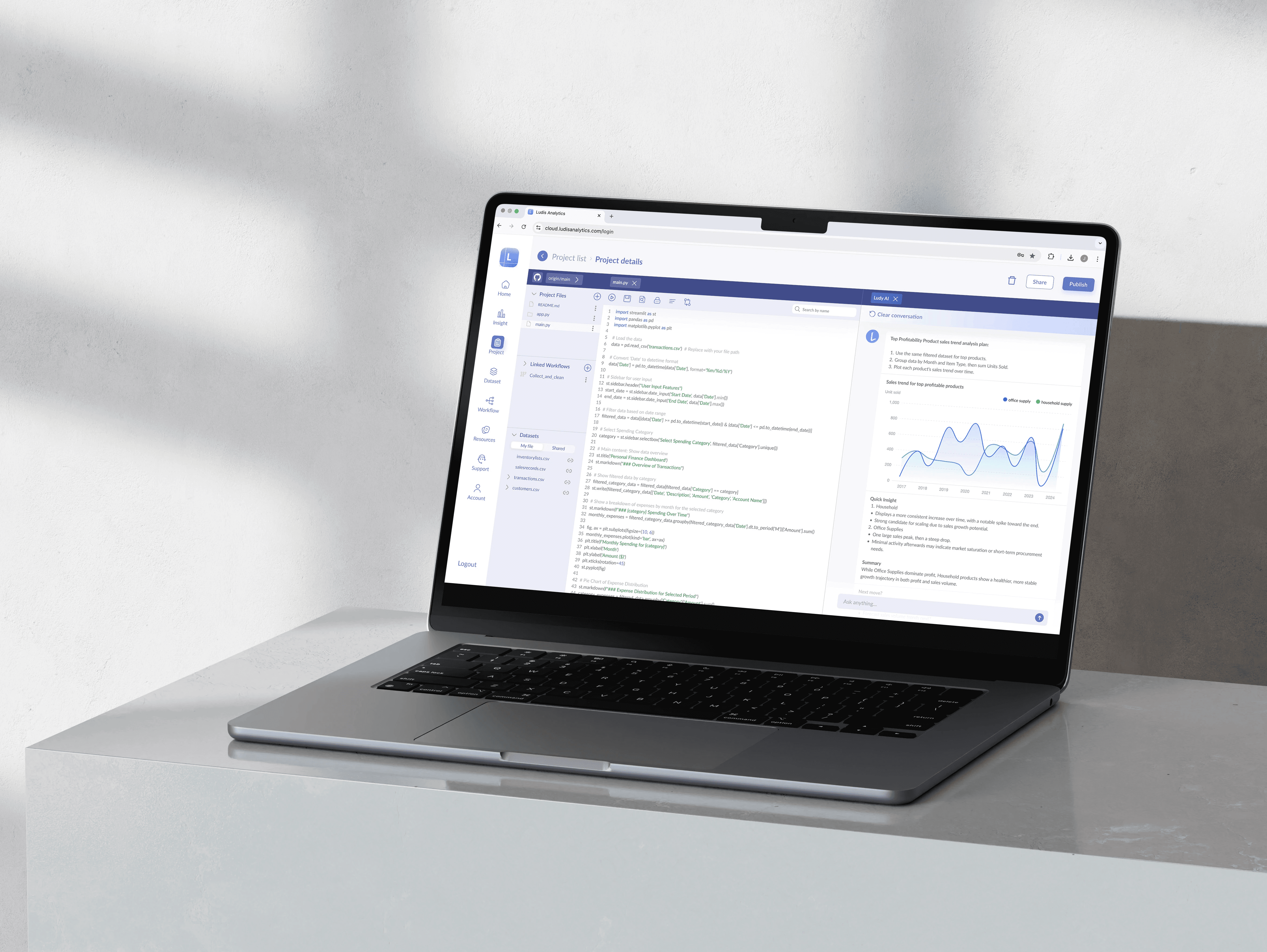
Ludy - AI Dashboard Builder
Users often didn’t know how to begin exploring their data. They struggled with prompt phrasing, got overwhelmed by messy outputs, and lacked confidence in the code they received. We designed a multi-layered experience that guides users through the dashboard creation process with clarity and confidence:
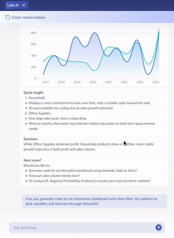
Quick insight
Instead of starting from scratch, users can ask natural language questions and get instant answers like key drivers or standout values. This speeds up early exploration and helps users quickly find direction in complex datasets.
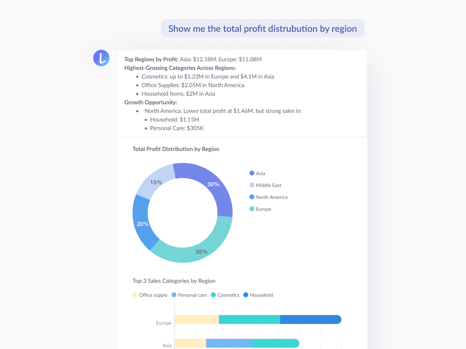
Insight overview
The assistant automatically points out trends, outliers, and correlations which guides users toward meaningful insights they might have missed. It acts like a built-in analyst that adds context to their exploration.

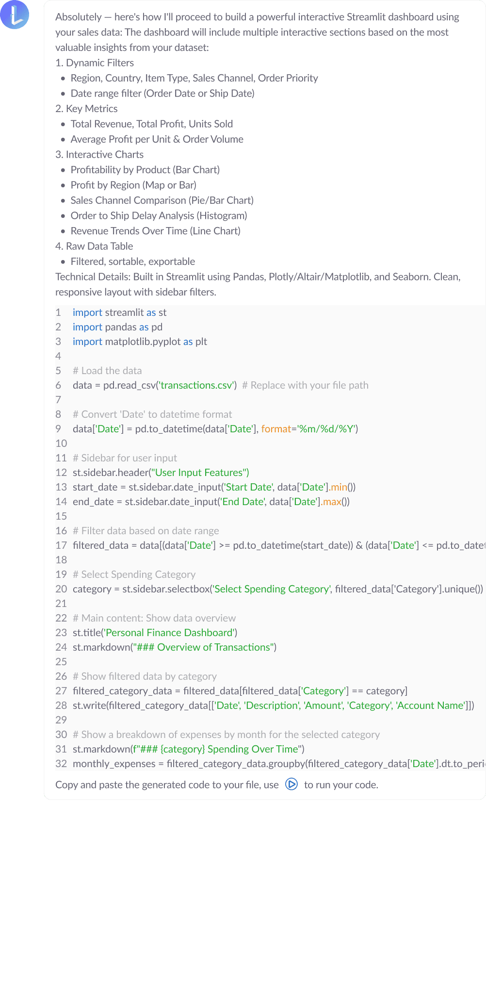
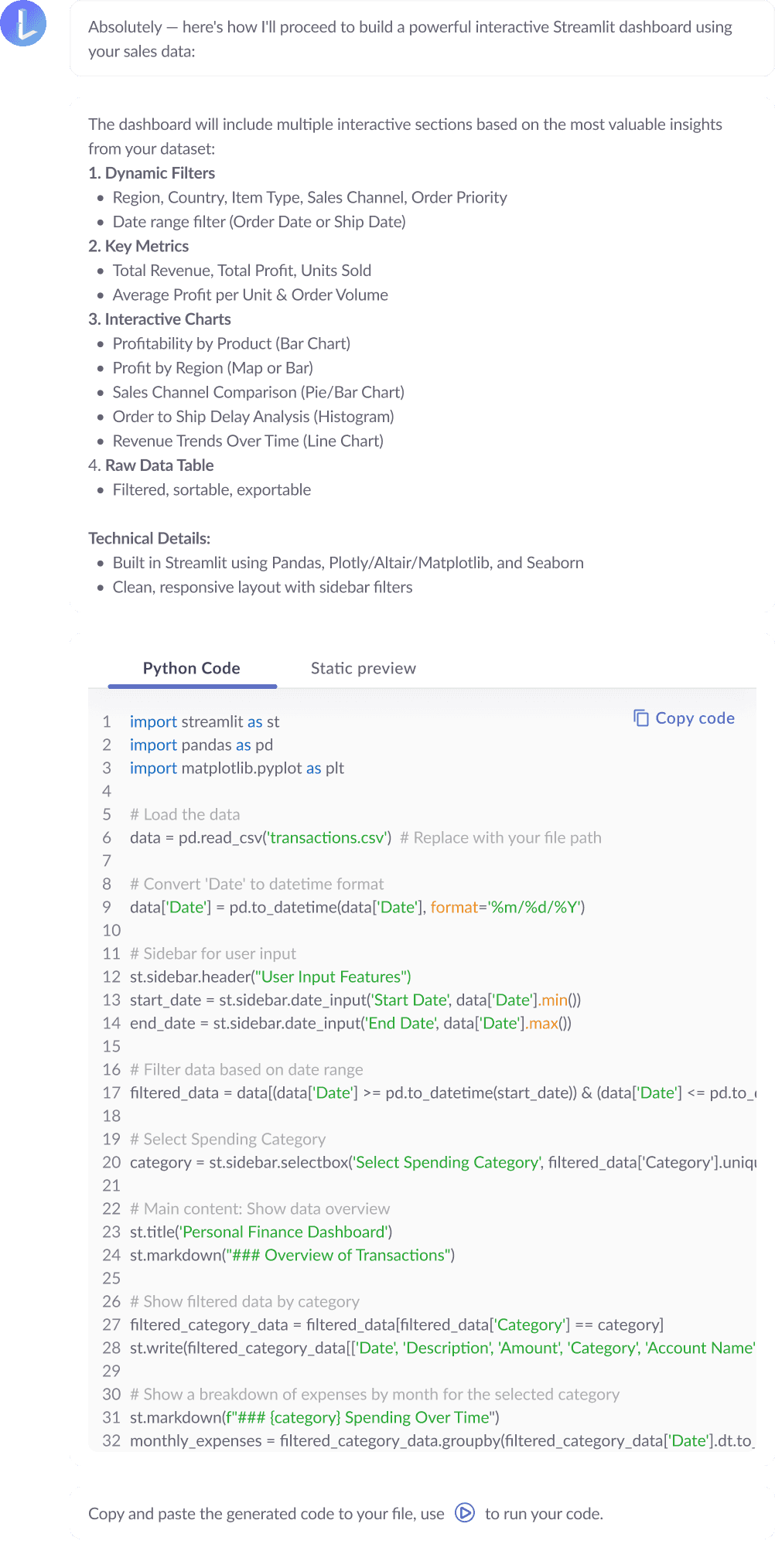
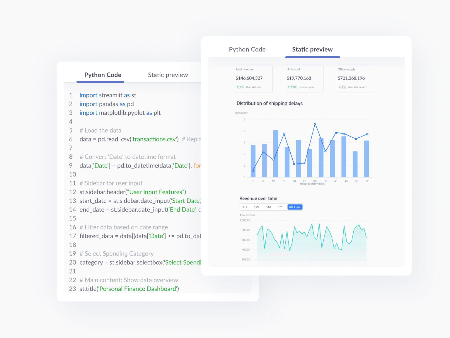
Code preview
To build trust in the AI-generated code, we designed a live preview that shows what the dashboard will look like before users commit. This lowers the barrier to entry and helps users feel more confident and in control.
FEATURE HIGHLIGHT
Log Summarizer
Dense logs overwhelmed users and slowed down their momentum. We turned this pain point into a moment of clarity by designing a log summarizer that translates complex logs into plain language with recommended actions. Instead of scanning lines of code, users now instantly understand what happened and what to do next which empowering them to stay in flow without calling in technical help.

FEATURE HIGHLIGHT
Debug Assistant
Getting stuck on bugs used to stop progress. Our Debug Assistant turns that moment into an opportunity. When errors pop up, the assistant suggests fixes, rewrites broken code, or offers next-step guidance—all within context. It’s like having a technical partner built into the workflow, giving users the confidence to solve problems independently and keep building.

IMPACT
Within 3 months of rolling out these updates:
28%
Task success rate increased
Ludy AI reduced confusion and guided users through complex steps, helping more users complete tasks successfully on their first try.
48%
Task completion time reduced
AI-generated insights and code previews helped users skip trial-and-error which speeds up the whole process.
90%
Active users adopted the AI feature
The seamless integration made the platform more intuitive, driving high adoption across technical and non-technical users.
31%
Dashboard creation increased
With clearer direction, easier debugging, and faster iteration, users were empowered to build more dashboards more often.
REFLECTION
Designing this AI feature required constant trade-offs between ease of use, system limitations, and building long-term user trust. By simulating user behavior, gathering feedback from beta testing, and partnering closely with engineers, I made product decisions that solved real pain points while supporting our broader business goals. This project sharpened my ability to turn complex workflows into meaningful, adoptable solutions.